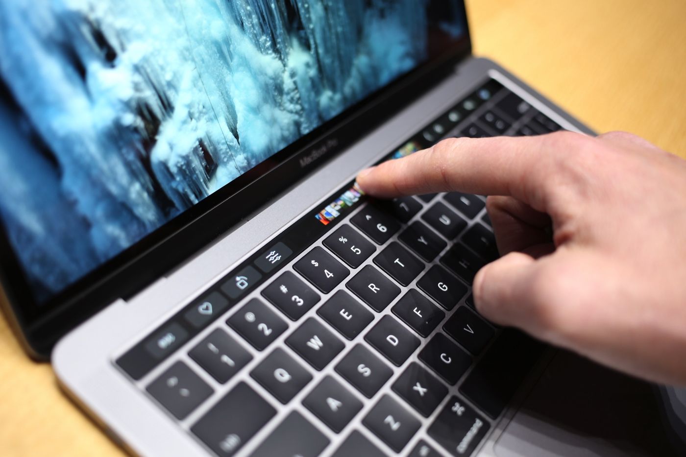
 Apple introduced the new Touch Bar on its latest iteration of the MacBook Pro. It is touch sensitive strip just above the number keys. It replaces the function key and adjustment button row. Initially, it was expected to be a drop in replacement with some form of customization capability. Instead what we got was a completely context aware touchscreen sitting just above the keyboard. Aside from the standard set of controls like Brightness, volume, mute the bar changes display based on the App in use. Third party developers can modify their existing programs to take advantage of this new capability. Here are a few of the things that can be done at the outset:
Photos
There are buttons for adjusting tilt, crop, and adding filters. You can also scroll through your images in a carousel via the Touch Bar.
Final Cut Pro
You can scrub through an individual clip or navigate the whole timeline of a larger video project.
Messages and Mail
You can add emoji from the Touch Bar, and it will even suggest emoji to replace words while you are typing.
Apple Music
Basic playback controls, such as play, pause, skip track all appear when you’re listening to music. Unfortunately, since the bar is context aware these will not show when another application is in use.
Siri
Siri gets a permanent location on the right-hand side of the Touch Bar. It will also make it much more likely that people will use Siri on the Macbook Pro’s now.
